CHRISTA DEBOLT
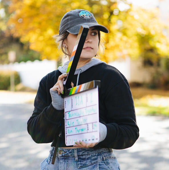
I am a senior Creative Media Production student at OU, and I specialize in video production and graphic design. My dream job has a healthy balance of all my creative skills. I am a team player with an eye for detail, I’m hardworking and passionate, and I always keep a positive attitude.Welcome to my portfolio website.
Here's some stuff that I've made!Contact Info
(918) 857-2076
[email protected]
Video
Video is my favorite. I enjoy all parts of the process: preproduction, production, and post production. I have worked in documentary style, commercial, narrative, and social media.
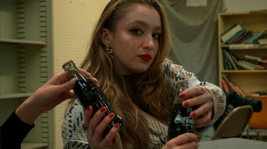
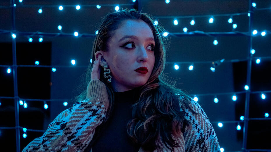
Out Of My Mind: Thanks To You (Official Music Video)
A music video for a local band that I wrote, directed, and edited. This project won a Heartland Student Emmy award and a OBEA award!We rented out a skate rink and filmed in one day, starting at 5am, moving quickly and efficiently. This project was a ton of fun to make, and I would love to make more music videos in the future.
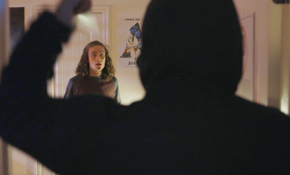
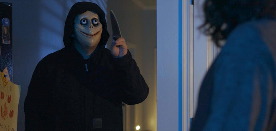
Grigsby
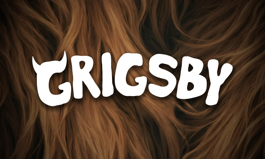
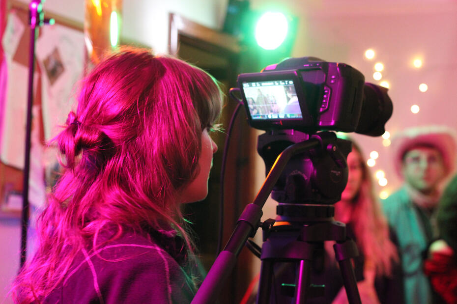
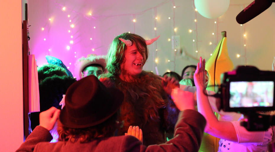
Grigsby is a story about a lonely monster who meets a group of friends on halloween night who accept him for who he is regardless of his monstrosity.This project was filmed over spring break with a ~20 person crew and a ~$1000 budget, and is currently in the post production phase. I wrote the screenplay, and I'm acting as executive producer as well as director of photography. I'm very proud of the work we have done and I can't wait to share the final product!
Mark McGonogale Must Die
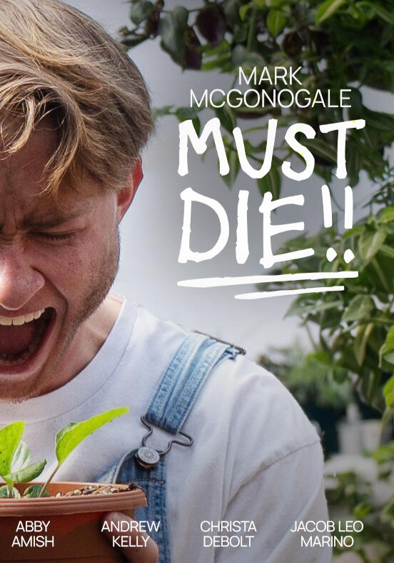
A fun narrative short, I was director of photography and helped out on art department. Coming soon!
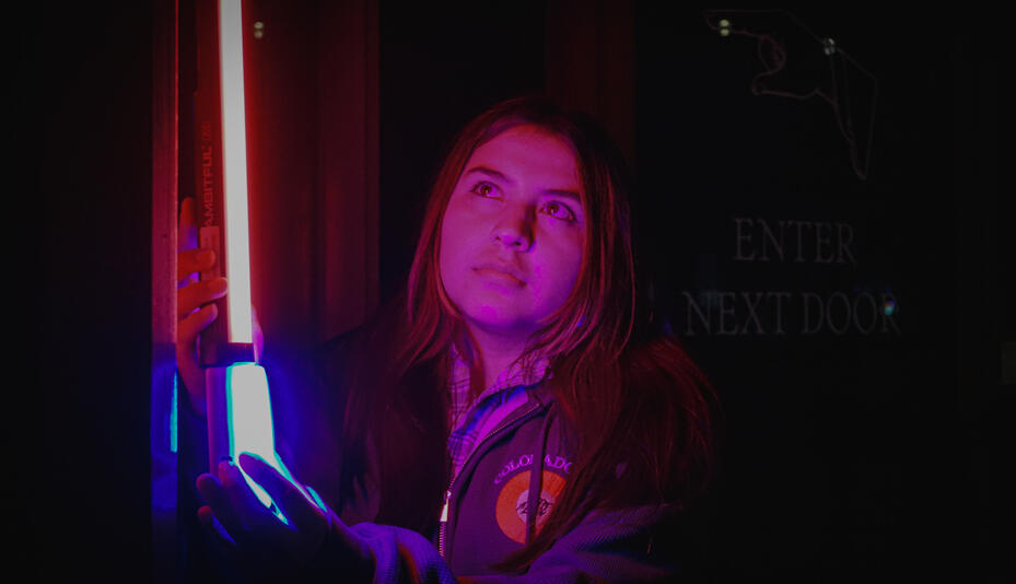
Neon
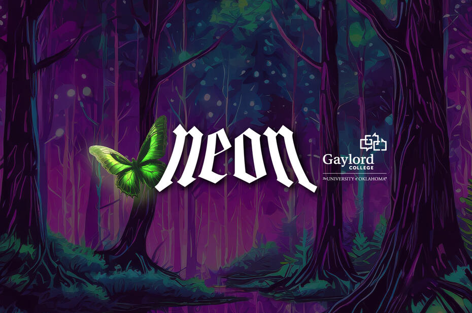
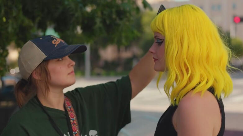
This summer, I worked on the University of Oklahoma's first feature length film. I was department co-head of hair and makeup, and also did some graphic design, painting, and behind the scenes photography.Even though I don't consider hair and makeup to be a passion of mine, I was able to use my organizational skills to keep track of continuity in both hair and makeup as well as costumes. It was a big challenge: there were over 30 costumes to keep track of, the makeup varies a lot between scenes, and we filmed things very out of order. We worked 12 hours a day for 32 days, on both units, using our weekends to plan and prepare for the next week.
A Post Production
I worked as 1st assistant director on this horror short. It was a 6 day shoot that I had to schedule, and then make sure we stayed on that schedule on set, constantly re-allotting time to make sure we wrapped on time. I was in charge of wrangling our 20 person crew and communicating between different departments. I also designed the branding!
Killin' Time
I am currently lead editor for a horror comedy short, "Killin' Time", which will be released soon!
Graphic Design
I have experience in branding, posters, advertising for print and social media, t-shirts, murals, menus, and digital illustration. I am proficient in Adobe Photoshop, Illustrator, Indesign, and Procreate. I have some experience in 3D modeling, web design, and animation. Did I mention I won a gold ADDY award?
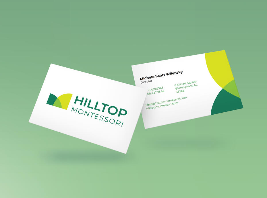
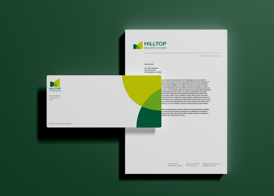
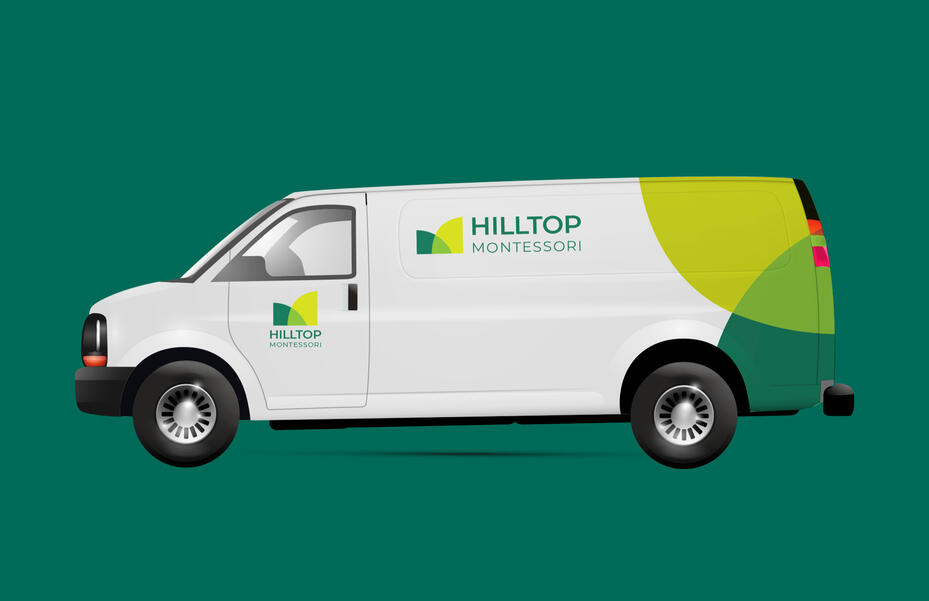
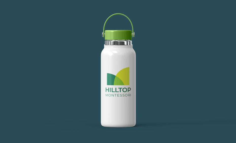
Hilltop Montessori Branding
I created an identity for Hilltop Montessori Schools that reflected the alternative montessori style learning and focused on conveying ideas of collaboration, creativity, and growth.The two abstract shapes overlap to represent collaboration, and they come together to make a new color to reflect the creation of a new idea. Shades of green and an upward diagonal represent growth.
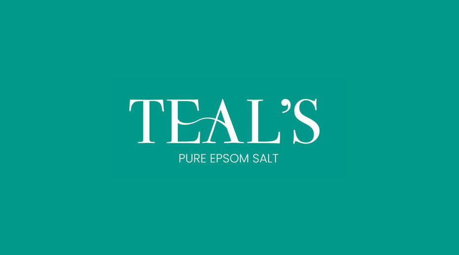
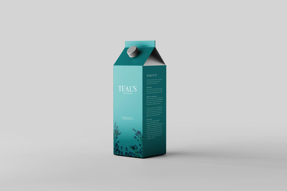
Dr. Teal's Brand Refresh
I rebranded Dr. Teal's Epsom salt to appeal more classy, elegant, and luxurious. It was important to me that I kept the typography and layout clean and simple. Dr. Teal's hasn't changed their branding since they launched in 2003, and it looks very medicinal, cold, and outdated. In my design, I wanted to convey the relaxation and calmness that the product provides.First off, I changed the previous blue to a teal to match the name. I dropped "Dr." to portray the brand as more of a self-care experience, less of a treatment for an ailment. I connected the E and A of Teal's with a calm wave to convey calming waters.I also changed the packaging of the product to be in a carton instead of a bag, because a paper carton is more eco-friendly than a plastic bag, which appeals to more modern audiences. The carton also has a screw top which allows for easier pouring straight into the bath.
Norman Regional Healthcare Posters
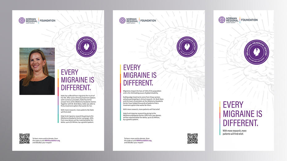
During my time with Lindsey + Asp, I was the creative lead on the Norman Regional Healthcare account. They needed some promotional materials for their fundraising campaign for migraine research, and they wanted to do patient testimonials. For this design, I wanted to focus on leaving negative space and creating a calm, clean look, without being too boring. These posters will be up in the clinic and the mailers will be sent out to the entire region!
Social Media: Sooner Success

Sooner Success' current social media presence now is very overcrowded with information and inconsistent, given that they work with other brands, their look is all over the place. But with such a people-facing mission, their brand needs to be a little more legible and easy understand for the families who need that information.I used their existing branding and color palette to make them several samples of templates for social media posts that they could use. Whether it's more photo focused or text focused, I made sure to give them variety. I also recommended that they keep their longer copy in the captions of posts instead of trying to fit every piece of information on one overcrowded graphic.
Symbol System: Oklahoma City Landmarks
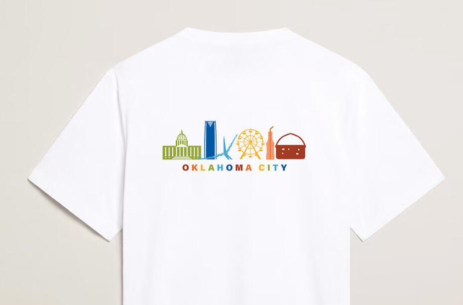
I was tasked with designing a group of simplistic symbols for six iconic landmarks of Oklahoma City. The six I was given had very differing levels of detail: the Capitol building being the most ornate. On the other end of the spectrum, the round barn has such little detail. The challenge was to find a middle ground where all of the symbols look like a cohesive family, equal in level of detail, readability, and style.This project required lots of tedious push and pull, working for over a month, removing and adding detail, and breaking each landmark down to its most signature and memorable parts. Deliverables for this project included ODOT compatible street signs, 6 city banners, a print booklet, and a shirt design.
Not Your Average Joe
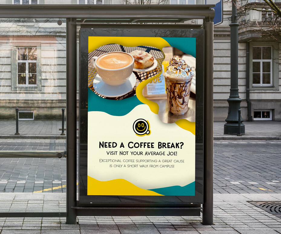
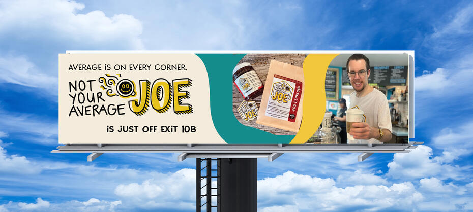
A series of ads for a local coffee shop that I'm a barista and job coach at. I noticed that I could use some of my skills to help them out as a small business. I redesigned their menu for them, made them a short documentary, took some photos, designed a couple t-shirts, and made a few ads. Including a billboard, some posters to be put up around campus, and some social media posts. I look forward to continuing to do more work with them in the future!
Branding for Outhouse Productions
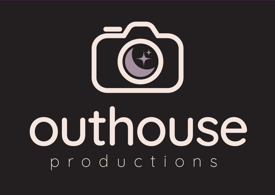
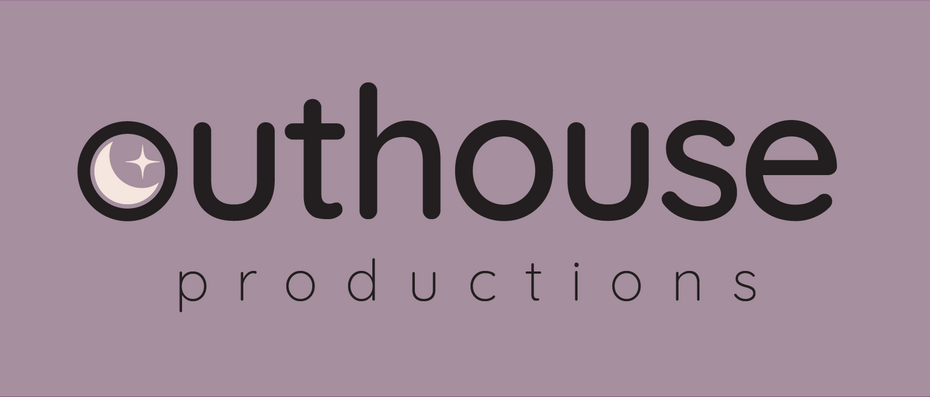
For Outhouse Productions, I wanted to keep the energy feminine, since they're an all-girl group. For the logo, I combined the idea of a moon from an outhouse and a camera lens. This brand is used on social media, business cards, and in the end credits of every film they make.
Book Cover Design: The Silence That Devours
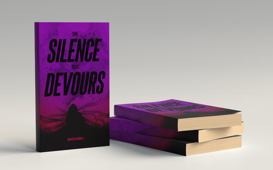
I got the opportunity to design this book cover for a student writing a novel! I met up with the author and had her explain the whole world of the book to me- the characters, themes, anything that evoked a particular emotion or visual trigger in my brain. This project made me much more confident in my ability to be creative and trust myself to be the expert!
Photography
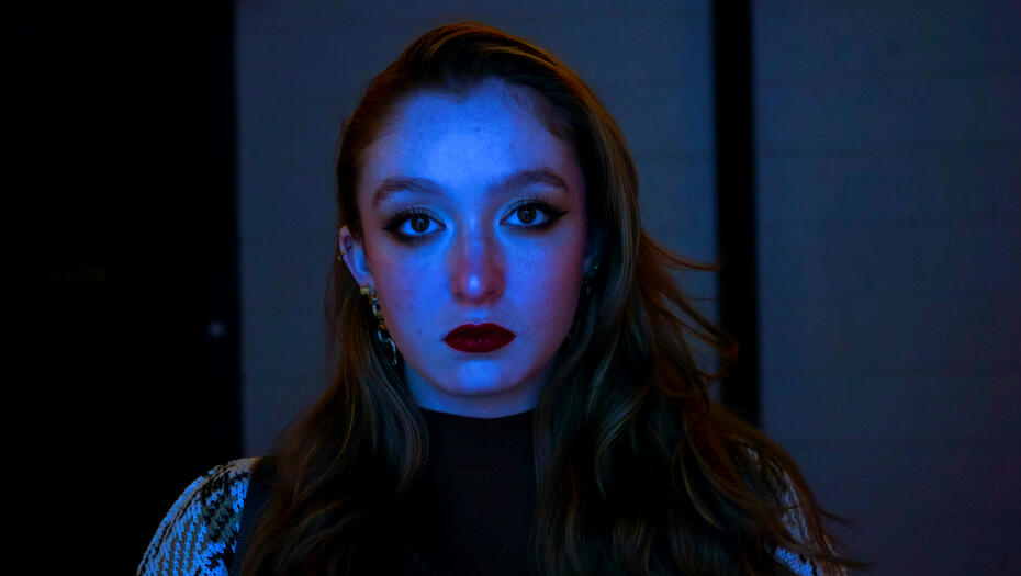
I'm currently working on applying my videography skills to photo: Whether it's using my friends as models for a random photoshoot, taking photos behind the scenes of video productions, or at events.